Tutorial Question: Look at the following information graphic broken down into a series of 4 images and answer the following question:
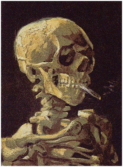


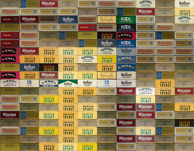
The original photograph is called "Skull with cigarette, 2007" by Chris Jordan. It has a caption below the photographs which reads: "Depicts 200,000 packs of cigarettes, equal to the number of Americans who die from cigarette smoking every six months". Why didn't the photographer just present the information in numbers? Why explain the statistics in graphical form?
This week, which is week 11, is the week of information graphics. Tidwell (2011) define information graphic as "to communicate knowledge visually rather than verbally." If the photographer just present the information in numbers, no matter what brand it is shown on the graph, the only thing that matters will be the total of number of deaths. Another reason is because of the range of months that is being used is only 6 months, which is too short to put on a data. There's also not much data to compare it to, even though there is different brands but it is still cigarette. In numerical form, there will be too much data for the audience to read.
With explaining the statistics in graphical form, as shown above, where it is very stimulating and interacting. With graphical form, it attracts the attention of the eye of the audience. Another reason is showing it in graphical form, it shows the story of the death because of what and by what brand. This is called Narrative, where Altman (2008), define it as "the practice of story-telling." The images tell a story of where deaths come to those who smokes, and when zoomed in, it shows of the brands of cigarettes that causes this deaths. With the help of the subtitle that comes with the photos help the audience further understand the picture. The subtitle of the image acts as an anchorage, to shape how we see things.
In graphical form, the audience able to read picture in a sequence. According to Tracey and Morrow (2006, p.51), people organize the knowledge they have learnt into knowledge structure or schema, this is called Schema Theory. This graphical form is not narrative but also instructive, showing the step-by-step instruction of why and how. Other else from Interactive and Narrative, it also exploratives, where the audience is allow to discover and explore the intention of the graphic designer. With graphical image also you could persuade people, where McQuarrie & Phillips (2008) state that rhetorics has been mainly worried on how to say it than what to say.
In conclusion, it is better to present it in graphical form than numerical form is because in graphical for, it is able to persuade people on the reason of death is because of smoking of every brand of smoke, it also tells a story, it is more instructive and let the audience explore what is the photographer is trying to say. The reason on why not to use numerical form, there'll will be too many data for the audience to read.
Reference list:-
Altman, R. (2008). A Theory of Narrative. New York: Columbia University Press
McQuarrie, E. F. & Phillips, B. J. (2008). Advertising Rhetoric: An Introduction. In McQuarrie, E. F. & Phillps, B. J. (Eds.)., Go Figure!: New Directions in Advertising Rhetorics. New York: M.E. Sharpe, Inc.
Tidwell, J. (2011). Designing Interfaces (2nd ed.). CA: O'Reilly Media Inc.
Tracey, D. H. & Morrow, L. M. (2006). Lenses on Reading: An Introduction to Theories and Models. USA: Guilford Press.
No comments:
Post a Comment